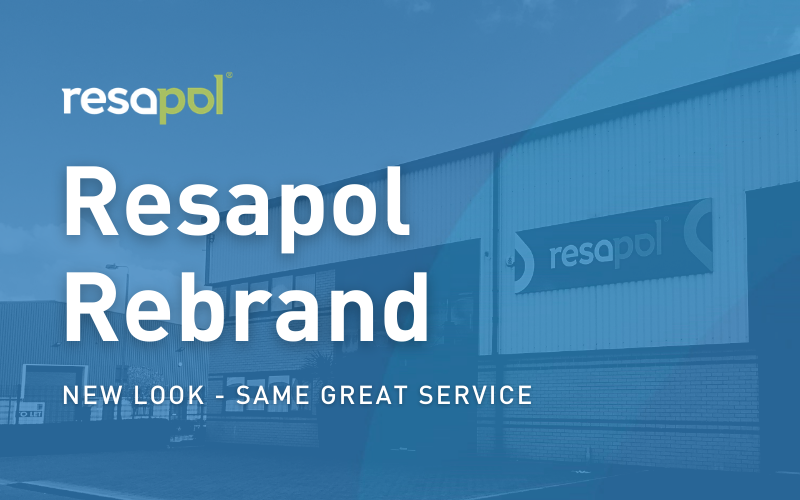
Resapol’s successful launch of their new brand identity has been rolling out over the past year. After a slight delay due to the COVID-19 pandemic, the coming months will see the company complete their transition into their new, vibrant & ambitious brand identity.
As the UK’s leading independent supplier of construction chemicals, Resapol specialise in stocking and distributing a huge range of market leading products from some of the industry’s leading manufacturers. Originally established in 1999, the chemical suppliers have now built themselves into the enviable position of market leaders within the industry, boasting UK wide coverage thanks to their strategically situated distribution depots that are spread throughout the country. With their continued growth has come the need to adapt the company branding to reflect this.
Resapol’s previous brand identity had been in place for over 4 years and was tied together with their simple 3-step ordering process that ensures technical knowledge, instant access to stock, and rapid delivery response was pushed to the forefront. Technical, Stock & Delivery previously proudly sat beneath the Resapol logo, designed originally in July 2017, and worked to illustrate this straightforward and consistent approach that Resapol have experienced when dealing with all of their clients’ individual needs.
The new company logo features a bespoke, sleek and modernised design alongside a strong two tone colour palette. The fundamental design is comprised of a device made up of two built in icons which effectively work to embody Resapol’s essential services; the first icon is a liquid droplet that represents construction chemicals, whilst the second icon features a map marker which represents Resapol’s ability to deliver their range of products anywhere in the UK.
Colour plays a strong part in the make-up of the new brand identity, with a primary colour palette of blue and green used throughout. The royal blue portrays the notion of stability & reliability, whilst the green palette works to instead portray wisdom & efficiency.
A new graphical style has also been established; this newly devised style primarily utilises overlays and transparencies layers, alongside bold statements and carefully selected imagery. When creating any online and offline communications Resapol now look to back up their creative messages with bold and impactful statements that define Resapol’s new approach, their main motto now reads “Supplying the foundation for your success” and perfectly illustrates the companies ambitious approach to not only delivery state of the art products, but to provide technical solutions based upon their individual client’s needs.
The new company logo, rebrand and graphical style have already been fully utilised within Resapol’s recently re-launched website, exhibition stand, company brochure, and a newly released merchant support brochure to great effect; with more marketing materials, originally delayed due to COVID-19, in production and ready to be released throughout 2021 and beyond.
“Innovative and creative solutions to our customers’ needs is really what sets us apart from other distributors, and we are now able to offer so much more than we have previously, such as our fully functioning website and new Merchant Support Centre. As we reach new levels of consistent growth a revamp of our company identity to portray these advances was the next logical step. We’re excited to now move forward with a much stronger identity that we can build upon year and year.”
Lloyd Phillips, Managing Director
